Published on: 10/28/2015IST
We Turned Foods Into The Words That Represent Them Represent
Fancy a bit of horseradish in your Mac ‘n’ Cheese? Or what about coffee in your Spaghetti Bolognese? Sounds a bit twisted – but that’s the whole idea behind Sainsbury’s “Twist Your Favourites” campaign, which we were asked to create some artwork for.
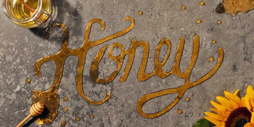
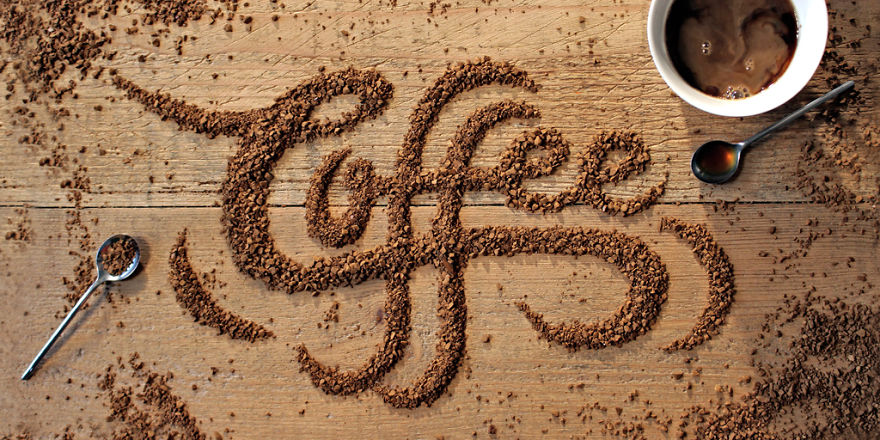
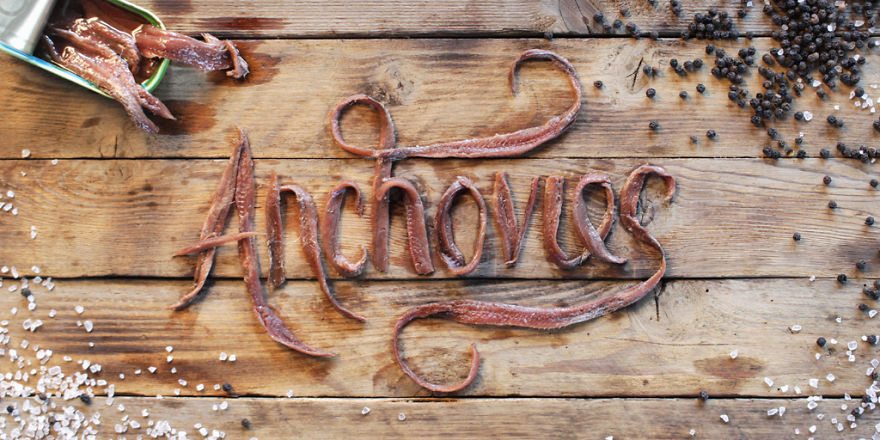
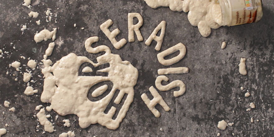
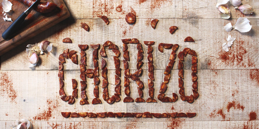
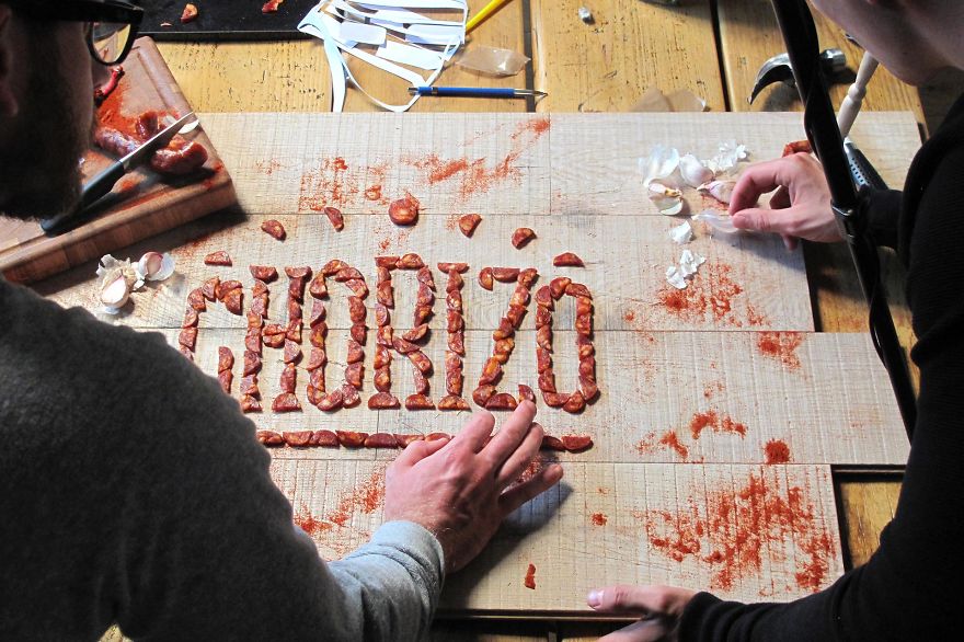
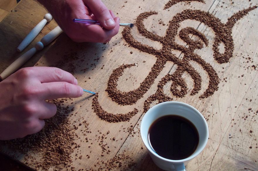
With six key ingredients to play with, we got stuck in creating some bespoke typography which would feature in the campaign’s digital adverts. We knew we wanted to produce something mouth-watering (literally!), and for there to be a connection between the type and ingredient.
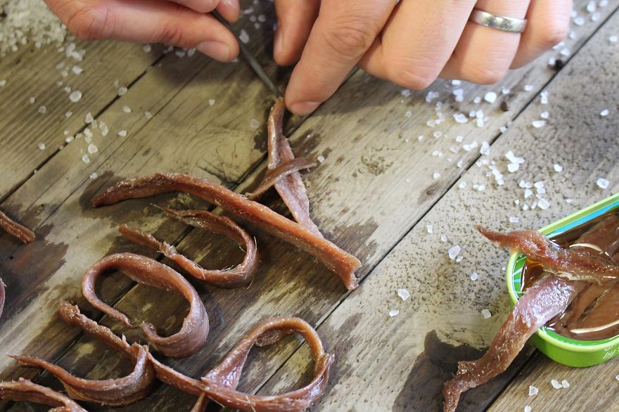
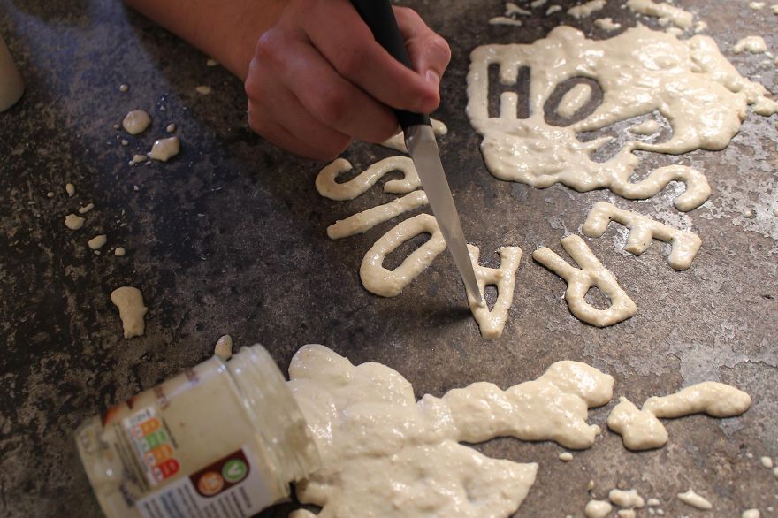
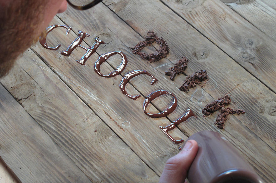
Each piece was handmade in our studio, and we sourced all of the props and backgrounds from local antique stores. One thing we’ve definitely learned is to not leave chorizo out overnight – mice love it.
Honey
Coffee
Anchovies
Horseradish
Chorizo
Dark Chocolate

Making of
10/28/2015 | | Permalink
